A few posts back, I called attention to a review I have up of Robert A.A. Lowe and Rose Lazar's Eclipses. Lazar is notably for being solely the album's graphic artist, yet retains an artistic credit for the whole of the album. This assignment of authorship is not an arbitrary title, it's a recognition of authority. When the Cahiers du Cinema critics were establishing their criteria for who takes responsibility for a work, they ultimately decided that the authority rests with an author, something which all but the most casual film fans tend to agree upon now (yet it's producers, the financial centers of the film, who receive the Best Picture oscar-go figure).
Albums always seemed to have less ambiguity about authorship. The artist listed on the cover is the creator and mastermind behind the piece in front of you (though artists rarely "own" their own music). In some instances, there can be a contention that the work is actually the product of a producer moreso than the musician, who is just the vehicle or instrument through which the producer's ideas flow. The graphic artist has always seemed supplemental, since they are not actually a part of the recording, but certain records are granted aura and mystery by a great work of cover art, to the extent that the iconography of the cover itself becomes embedded into the music. Can bad cover art make an album "sound" worse? It certainly sounds superficial to think this could be the case, but since sound is reactive and intimately linked with the other senses it may just be that an album linked with shallow or tawdry iconography can get debased in the ears. The current era's solution, stripping music of all imagery, leaves us to our own poorly-establised echolocation.
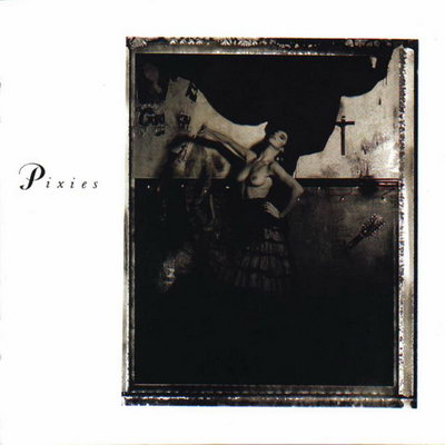
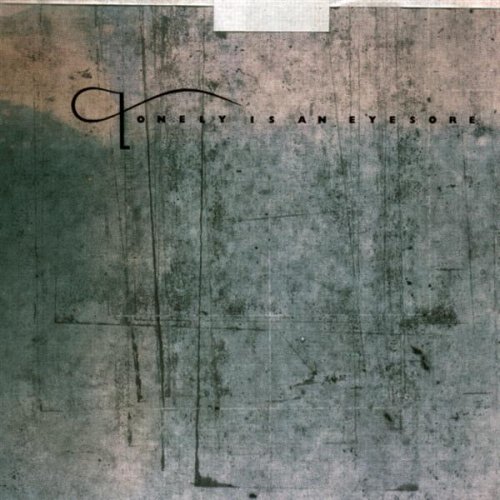
Idiot's Guide to Dreaming linked to the page at Rate Your Music devoted to the art of Vaughan Oliver (of 23 Envelope), who was kind of a 4AD house artist and responsible for much of the mystified persona of that label. It's interesting looking through his collections and seeing how many things remain gorgeous works of art and how many seem extremely dated by the fashions of the time. Most of it is merely typography, which can offset the allure of an entire piece. There's also the whole "frame-within-a-frame" thing that seems to have been put to rest post desktop background patterns (which may be a product of record or cassette to CD transition):


Some work better than others:

For some reason, particularly with nudes:

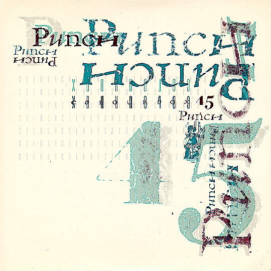
The typography menace even continues to present day, as evidenced by this hideous cover:

Yet, in terms of iconography there's too many to mention:


No comments:
Post a Comment
Note: Only a member of this blog may post a comment.